The CDC
Project Brief
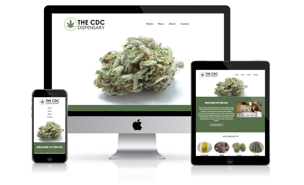
The CDC is a small family owned marijuana dispensary located in Tigard, Oregon. They sell a variety of cannabis products to medical and recreational customers. The owners came to me for a new logo and a simple one-page website.
The Logo Design
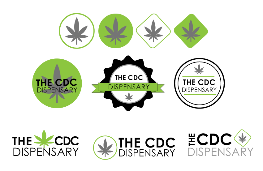
I used a leaf shaped icon from the web, sans-serif typeface, and a limited color palette to create clean and basic designs. I wanted the logo to be flexible and easily recognizable. The final logo has a circle surrounding a leaf that best represents the company's mission of wanting customers to feel safe and protected. The color green symbolizes health and nature.

Final logo

The Website
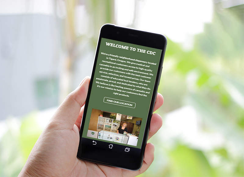
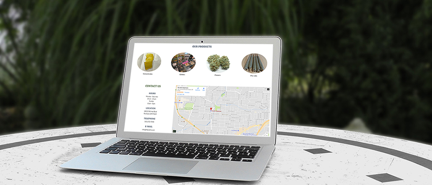
The owners wanted a simple design that was easy to use and looked great on mobile devices. I used bold headings and minimal content to ensure easy navigation. One of the issues that the owners had was people having difficulty locating their business. To help with this problem I created a prominent find our location button that takes users to the business's address along with an embedded a google map. I hand coded this website using HTML5 and CSS3.

